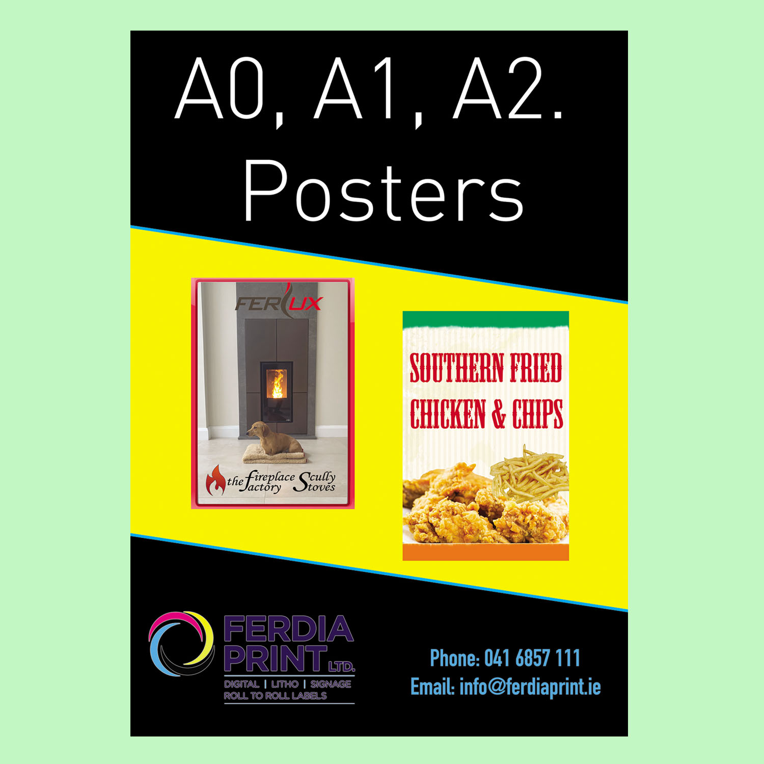
Poster Design
Design should focus on hierarchy. What’s the most important thing? Event name? Offer? Date? That needs to be biggest. Then the supporting details smaller. Too many posters fail because everything is the same size. The viewer doesn’t know where to look first.
Colour contrast again plays a role. Light text on dark backgrounds can work well for gigs or nightlife events. Bright colours can grab attention for sales or promotions. Just don’t mix too many competing colours. It becomes messy fast.
Paper choice depends on use. Indoor posters can use standard or gloss paper. Outdoor posters might need heavier stock or lamination depending on exposure. Irish weather is unpredictable, so if it’s going outside for more than a day or two, it’s worth considering protection.